Year
2025
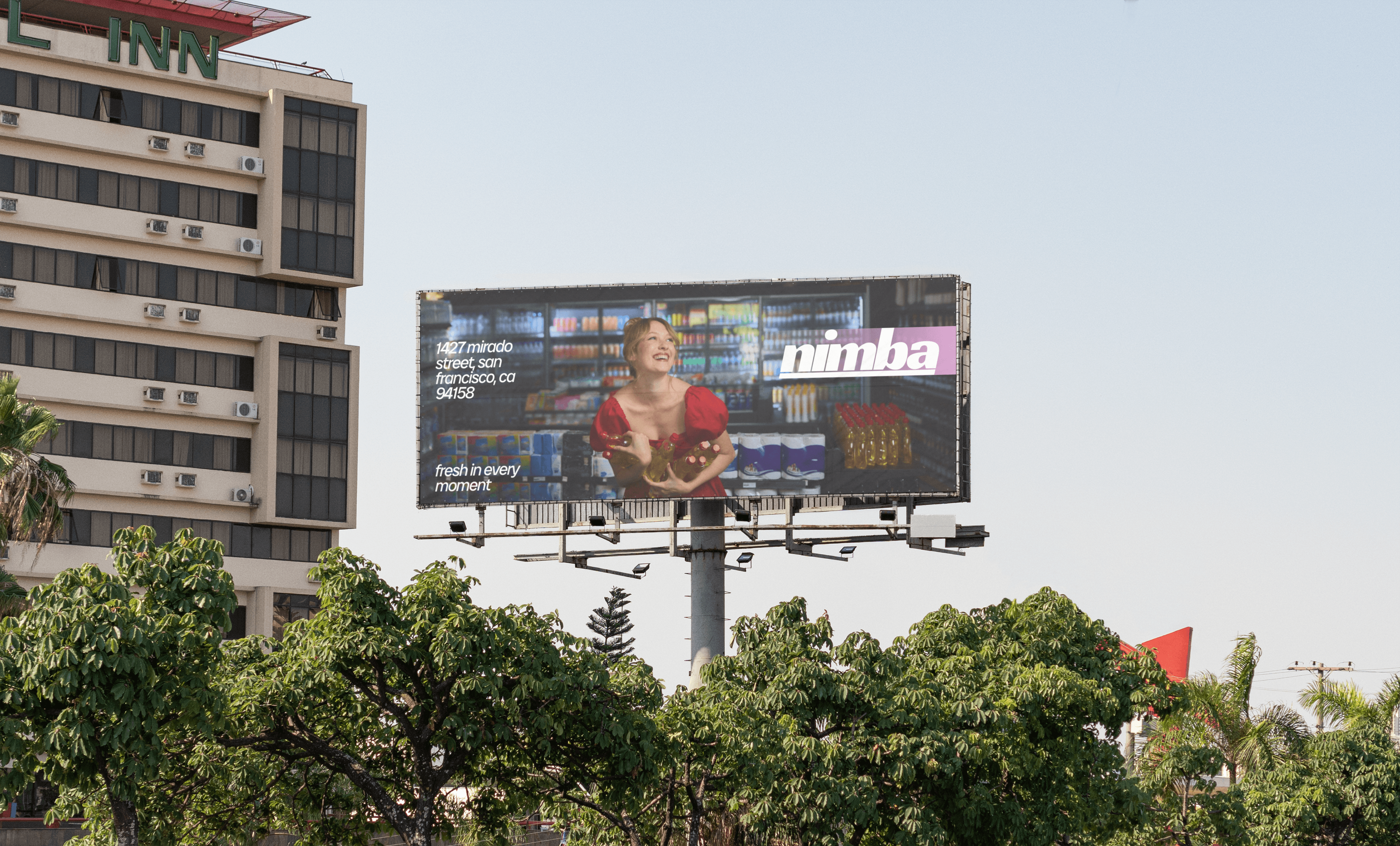
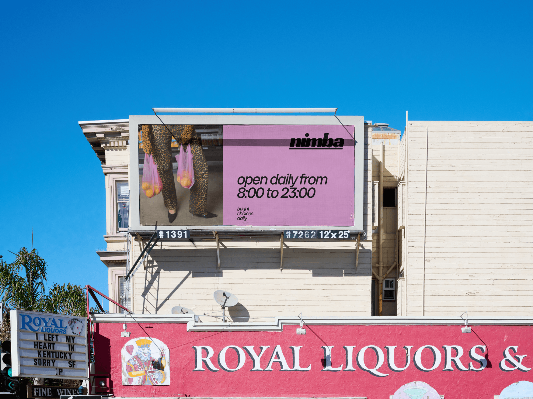
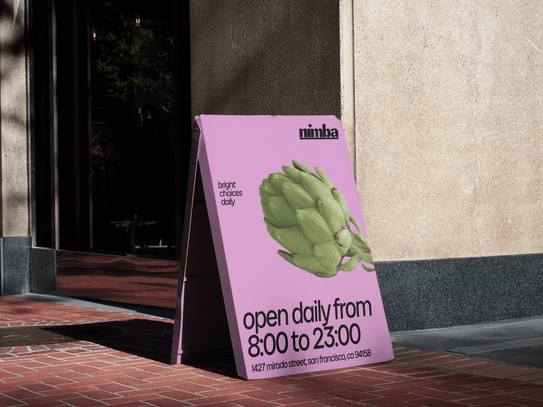
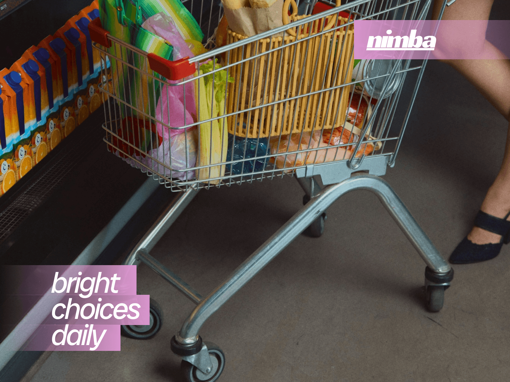
Nimba is a new-generation grocery chain built around bold color, clear geometry, and an energetic visual language designed to stand out in any city.
The branding project focused on creating a name, identity system, and communication style that feel vibrant, modern, and unmistakably alive — without referencing “health” or eco-narratives directly.
The core idea behind Nimba is simple: make everyday shopping emotional.
Color, rhythm, and shape work together to create a sense of liveliness. The brand uses a saturated palette, confident typography, dynamic patterns, and a friendly tone that forms a distinct cultural attitude.
The project included naming, the full visual identity system, graphic foundations, pattern logic, color rules, tone of voice, packaging direction, and in-store communication principles.
Every element is designed to make the brand instantly recognizable — from signage and labels to digital touchpoints.
Nimba represents bright everyday living — a grocery experience that feels energetic, modern, and filled with personality rather than routine.